This story is part of Ensemble’s colour week, presented by Resene
As a kid, I was obsessed with Jenny Joseph’s 1961 poem Warning: ‘When I am an old lady I will wear purple / With a red hat that doesn’t go, and doesn’t suit me.’ As I age, I wonder if this poem is the story of my life. One of my favourite ‘fits is a purple Kate Sylvester dress with a red Videris bra, and I’ve even painted my bach bathroom a vivid violet – pure joy every time I pee.
Colour has always been part of my personality. Working for Kate Sylvester early in my career, I had a healthy clothing allowance that gave me the freedom to play with bold hues and embrace the emotions they sparked; without it, I may have been more conservative with my purchases. But this story isn’t about me – it’s about some of the coolest creatives in the motu, and what colour means to them.
Natasha Ovely, designer and stylist

How has your relationship with colour changed over the years?
Colour is such a huge part of Indian culture. I was immersed in it when I was young, which helped me learn how to use it effectively. My mum always wore bold colours under swathes of black when she had to wear a hijab in Saudi, so it may have forged a connection with rebellion or autonomy for me.
When I designed Starving Artists Fund (RIP), I primarily wore black and white. It became a sort of uniform because I found colour too distracting to wear while working in the studio. Learning to use colour strategically in design is a complex process of balance, but when it comes to clothing, it is pure intuition and mood. But over the past year, I've reintroduced colour into my wardrobe.
I think the aversion to colour and maximalism during the lean towards "quiet luxury" is so deeply rooted in a Western (and classist) lens. It implies that it’s bad taste even though it is heavily representative of cultures like my own.
With that in mind, I love using colour in my styling mahi when the brief calls for it. I think it is a powerful and emotive tool in storytelling.
You have incredible style that often incorporates colour (and print). How would you describe that style, and your approach to wearing colour?
Thank you! I would describe my everyday style as a grab and go – whatever is in my eyeline ends up on my body. More often than not, my jewellery and makeup carry the fit. I think I conserve my energy for 30% of the time when I really go all out. When I do, I am a huge fan of layering and using different textures, prints and colour in tandem. I love accessorising my hair and love a weird shoe to finish a look!
Are there any homeware brands, fashion designers/brands or artists that you think approach their use of colour especially well?
Ooh yes, so many! Photographer Rafael Pavarotti and fashion designer Christopher John Rogers are true modern-day masters of colour, in my eyes.
Locally, artists Brunelle Dias, Claudia Kogachi, Amanda Gruenwald, Cat Fooks, Hannah Ireland and The Killing are doing exciting things with colour. I recently watched Mixtape for Maladies by Ahi Karunaharan, set during the Sri Lankan civil war and it was a feast of colour and emotion, a trademark of Ahi's work.
Designers Richard Malone, Bad Binch Tongtong, Masaba Gupta and Ashish are beautiful examples of using color with intention.
When it comes to interiors and homeware, I love the work of Ettore Sottsass, Gaetano Pesce and Freeling Waters. I also own a few treasured pieces from the Toilet Paper X Seletti homeware collection.
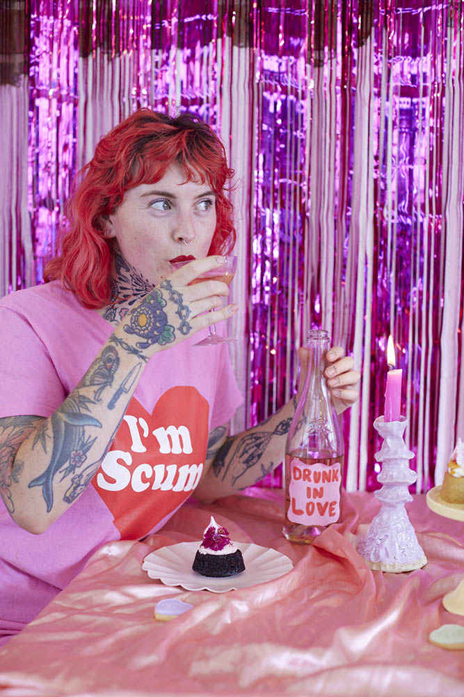
Jack, owner of Neat Cakes
How has your relationship with colour changed over the years?
I’ve come a long way from the black skinny jeans, Raglan tee and Chuck Taylors that used to be my uniform. I definitely have a fixed palette that I lean towards – black, white, pink and red – which shines through in my wardrobe, art and shop. I try to embrace colour and patterns a lot more these days. A pop of colour always helps when I’m trying to brighten my mood!
Do you have a favourite colour?
Baby pink. It’s such a comfort colour for me, but I also love bright orange. I’m naturally drawn to warm sunset tones.
Colour is a big part of your mahi. How would you describe a cakemaker's relationship with colour?
This is a complicated one. I LOVE colourful cakes but don’t love having to use food colouring to achieve them. My favourite ingredient to achieve a beautiful natural pink tone is freeze-dried raspberry powder – it adds natural colour and flavour without the artificial colour. Fresh flowers are also an easy way to add more colour and dimension.
What shades are people drawn to when it comes to food?
I’m not sure if it’s because it’s summer, post Valentine’s or because we just finished Aquarius season, but I was making a lot of pink, orange and red cakes. Warm tones will always be my favourite and I feel like people are naturally drawn to these in warmer weather.
What would be your advice for someone wanting to incorporate more colour into their life?
A full pink outfit always slays. And find your comfort colours. I wear a lot of orange when I’m feeling fun and flirty, lilac for comfort at home, a little black dress when I want to feel sexy and green when I want to feel cosy. Figure out what you feel comfortable in and then browse op-shops for your palette, it makes life so much easier.
Tallulah McLean, makeup artist

How has your relationship with colour changed over the years?
I love black. I wear it all the time and it’s pretty much the sole colour in my wardrobe. This leaves the face as a bare canvas to be as bright and as colourful as I like. As I’ve gotten older and my confidence grows within myself and my art, I get more experimental with different colour combinations.
Do you have a favourite colour?
Baby pink.
Colour is a big part of your mahi. What is it about colour that excites you as an artist, and have you ever had any pushback or expectation to tone things down?
When I first started, I remember a few other MUAs saying I'd do better if I toned down and went a bit more traditional with my makeup. I did ponder it for about half a second, then remembered that good old saying, “build it and they will come”, and that’s exactly what I’ve done. I’ve managed to create a brand identity for myself built around colour and boldness. It excites me seeing people’s reactions to me using colour on them in different ways than they expect
What makeup shades are people gravitating toward right now?
The 80s are BACK baby! I’ve been saying this for a few months but we're seeing a resurgence of bright and colourful looks, but with the 80s twist. Metallics and chrome is in. Draped blush in bright poppy shades of strawberry and peach. Bright lipstick is finally returning! Hurray!
What would be your advice for someone wanting to incorporate more colour into their makeup routine?
Start small. Invest in a cheap colourful eyeshadow palette and start popping on the inner corner. Use a colour for a wing, smoke out your lower lash line. These days there are some bomb eyeliners in fun bright colours for your waterline – an easy and doable way of trying out colour.
When it comes to fashion, beauty and homewares, are there any brands or designers that you think approach their use of colour especially well?
Isamaya Ffrench, Pat McGrath and Danessa Myricks are always bringing out the most insane colour stories with unmatched staying power and pigment. They are all incredible artists who understand how to make wearable colour for everyone.
Lisa Beauchamp, curator of contemporary art Gus Fisher Gallery/Te Whare Toi o Gus Fisher

How has your relationship with colour changed over the years?
I’ve definitely gotten brighter over the years. I think the more I started shopping vintage and second hand, the bolder I became. I’ve always loved earlier eras – the 1960s mostly – shift dresses and bold eyes. I love 60s music. The last time I can remember wearing black was in my 20s when I went through a phase of wearing lots of monochrome and red. Then I started embracing shades of blues and greens, and my wardrobe grew from there. I love turquoise, lilac and orange, and I’ve also started wearing red again after a few nice comments. If I’m not wearing bright colours now, people ask if I’m okay.
How would you describe your style, and approach to wearing colour?
I just don’t own any dark colours like black or grey so if you haven’t got it, you can't wear it. Bright colours cheer me up – it's hard to feel down in orange. I do love black on other people though; musicians always look so cool in it. I’ve never wanted to fit in – if the uniform is black jeans and a leather jacket, I’ll put on a vintage dress, big earrings and lashings of eyeliner and I feel great. I rarely wear heels as I can't walk in them. Flats all the way!
Do you have a favourite colour?
This always changes. Turquoise and mint green, I love. But at the moment, I’d say lilac. We have a lilac curtain up as part of our current exhibition at Gus Fisher Gallery and I’ve realised that I’m basically an extension of it as I always seem to have something lilac on. Oh and I love a bright green. The green of my cat's eyes – just gorgeous.
Do you tend to be drawn to specific colours for specific areas of your life - say for fashion, makeup, interiors or art?
They all feed into one another really. My home furnishings are mostly orange and green but I also love to clash: a paisley throw, random flowered cushions, a persian-style rug. I hate matchy matchy which influences what I wear and perhaps my chaotic personality. I love op shopping and I’m like a magpie just picking up bits and bobs that I think are quirky.
Are there specific artists that you think have a particularly interesting use of vibrant colour in their work?
We’re showing a Pipilotti Rist video installation at the moment and she’s amazing with colour. The baby blue dress of the woman strolling down the street with her red shoes like Dorothy from the Wizard of Oz leading her into these wild acts of violence as she swings a red-hot poker flower to shatter car windows. The police-woman’s pop of red lipstick and the red cape of a passer-by, it's all just so visually seductive.
Kate Megaw, designer Penny Sage

How has your relationship with colour changed over the years?
I’ve always loved playing with colour, especially in fabric, where texture adds so much depth, it makes a colour feel alive.
I think my love and sense of colour comes from my mum and grandma, who both had incredible flower gardens when I was growing up. The surprising combinations that happened naturally, the instinctive way they planted certain things next to each other, and then seeing those combinations bloom together, that all stuck with me. Now, I love choosing flowers for our shop to complement the clothes, and I often find myself playing around with the racks, rearranging colours when I need a break from other work. I find it therapeutic, and it can make a whole collection feel fresh again, it's kind of like my own garden.
Colour is a big part of your mahi and the Penny Sage brand. What do you take into consideration when incorporating colour into your collections?
This is one of my favourite parts of creating a collection – I approach it very instinctively. I’m drawn to certain colours and combinations at different times and don't always know why. I trust that if I love it and it excites me, someone else will love it too. Colour is often what draws people to a style first, even before silhouette.
What shades do you see people being drawn to at the moment? How do you balance commercial considerations with incorporating colour?
Lately, I feel like lots of people are drawn to earthy tones. Maybe we’re all craving more connection to nature. For our upcoming winter collection, we’re using a lot of rich, grounded shades – deep browns, forest greens, and warm reds. Certain colours feel inherently wearable, while others might be more niche. I try to make space for both - the ones I know will resonate widely and the ones that might be more unexpected but still feel essential to the collection. It’s always inspiring when those niche shades get a lot of love.
You have incredible style. How would you describe your style and approach to wearing colour?
I think colour is such a mood thing, it’s instinctive, and I like to wear what feels right in the moment. Some colours always feel like home to me, like deep greens and browns, but I also love experimenting with unexpected combinations.
Sometimes, the best ones are a bit ugly at first, you can’t tell if you’re repulsed or delighted, which makes them all the more interesting. If I’m drawn to a colour, I’ll find a way to bring it into what I wear, even if it’s just in a small detail or an accessory. Colour has such a strong emotional pull, and that’s the most important thing - wearing it because it makes you feel something.


